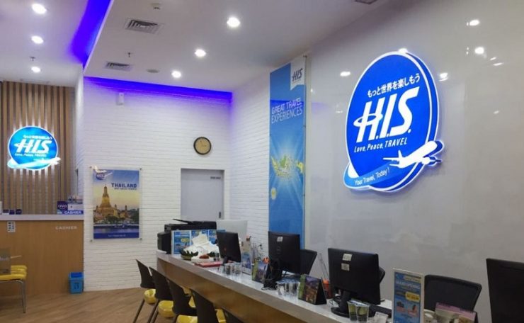

ENTERING the age of 40 years, the Japanese travel agency HIS, changed its logo to show the company’s new identity in welcoming the development of the travel business.
According to Hideaki Oshima, President Director of HIS Travel Indonesia said looking back, the travel business has now changed significantly. We are in an era of great change. HIS will continue its mission to make traveling a pleasant experience for everyone.
“Unlike the previous logos which are alphabet centric or focused on alphabet letters, this new logo was made so that all people could remember even those who could not read letters – for example preschoolers,” he said.
Hideaki Oshima mentioned that so this new logo is displayed in square and circle shapes as the background for the three letters H, I and S. HIS wants to be identified through a logo that is friendly and universally accepted, in accordance with the company’s philosophy that reads “Contribute to the creative development of humanity and world peace in harmony with the preservation of nature”.
Their logo has changed since its establishment from 1980. Almost every 5-10 years the HIS logo is always updated following the development of design trends. The new logo is referred to as HIS Connected Blue. Through the latest design, the logo appears more modern in a blue bandage but retains their three-letter character.
This logo change will be implemented in stages and is expected to be completed by mid 2020. Founded in 1980 in Japan, Hideo Sawada, the founder started a travel business with only one telephone and two desks. Now they are in 71 countries, including Indonesia, with a total of more than 700 employees in Indonesia. [antaranews/photo special]